Mixing and Matching Bracelet Colors
Your colors, your way
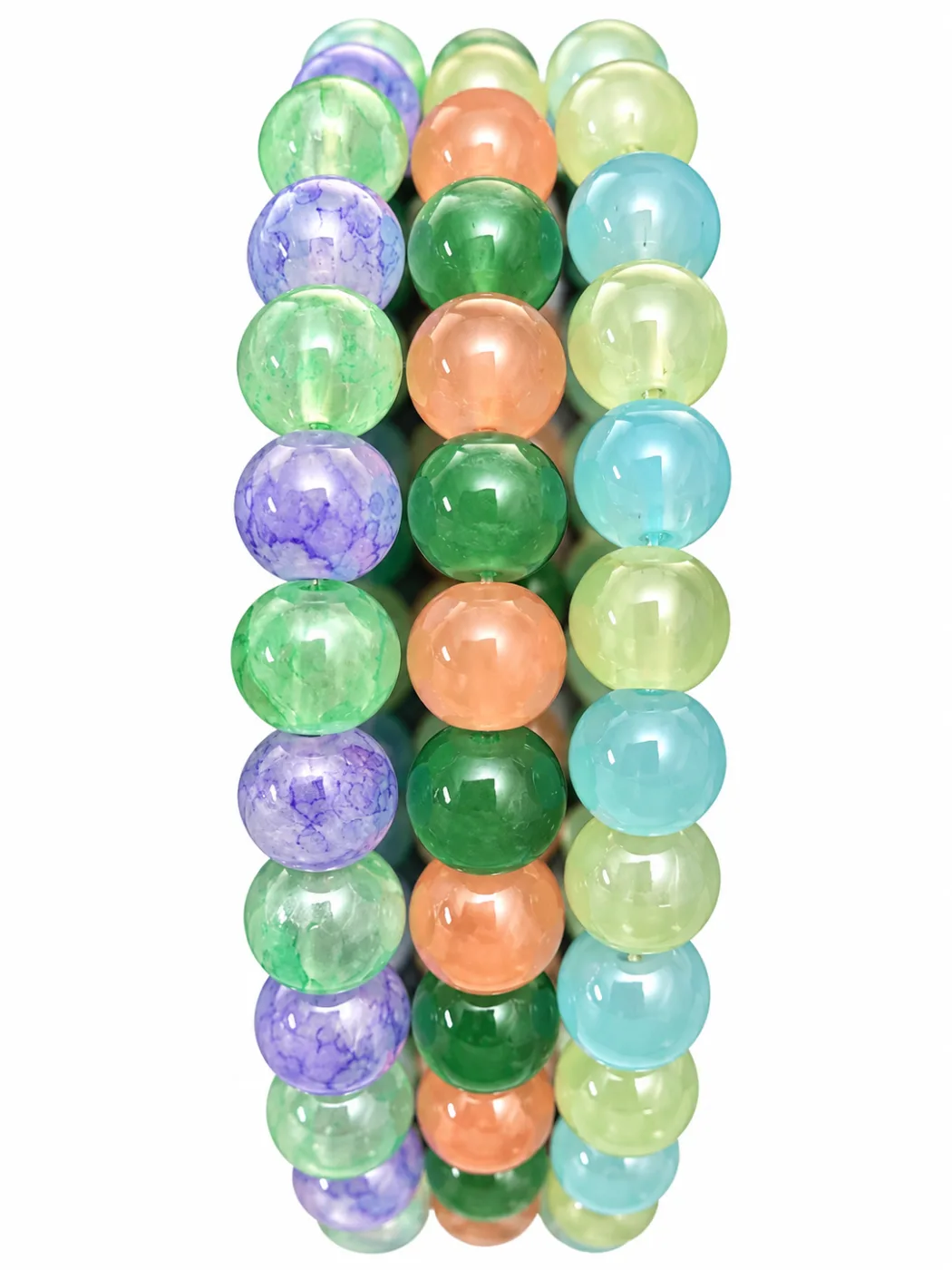
Color mixing is play, not a test 🌈
Choosing bracelet colors can be as simple as picking the shades you like. If you want a little structure, try one of these easy approaches: stay in one color family, repeat a favorite shade, or put one bright color beside a quieter one.
Build around one favorite color
Choose one color you already love, then look for nearby shades. Pink can move from pale blush to hot pink. Blue can shift from sky blue to turquoise. Repeating a shade across more than one bracelet helps a mix feel connected even when the designs are different.
Try a color family
Colors that share a mood can make a relaxed combination. Soft pastels feel gentle together; sunny yellows and oranges feel bright; greens and blues can feel fresh. You can find this kind of mix in actual product palettes too. Garden uses hot pink, lime, cream, and pale lilac; Lagoon brings together aqua-mint, lavender, spring green, and coral-orange. Check their current photos and listings for the exact design details.
Use contrast on purpose
A contrast color draws attention. Try one bold shade beside cream or another quieter color. Or let a bright bracelet sit next to a pastel one. If you love a high-energy mix, use several strong colors together and let the whole stack be the statement.
Look beyond color
Color is only one part of a bracelet. Bead shapes, shine, matte surfaces, and charms also affect how two pieces look side by side. If two bracelets feel too busy together, separate them with a simpler design or wear just one at a time.
Make a small test stack
Put two bracelets together first. Notice what your eye goes to. Add a third only if it brings something you like: another shade, a new texture, or a charm. If you are unsure, take a quick photo of the combination. A picture can make it easier to see whether the colors feel balanced to you.
Try these starter ideas
- Soft mix: cream, blush, and pale lilac.
- Garden mix: pink, lime, cream, and a light purple accent.
- Cool mix: blue, aqua, and turquoise.
- Bright contrast: one vivid color next to a pale neutral.
These are starting points, not rules. You can wear colors that match, colors that contrast, or colors that make you happy for no explainable reason.
Browse the Garden set, Lagoon, or all current bracelet designs for real color combinations. Check current availability and the listing details before ordering.
Love a little color?
Explore more bracelet inspiration or browse the actual product listings.